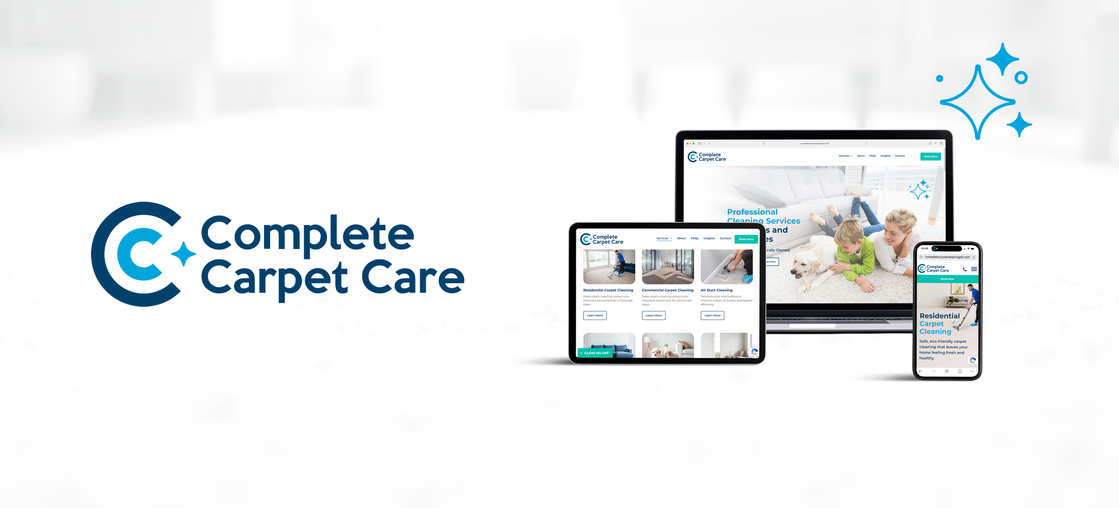
BRAND IDENTITY | WEBSITE DESIGN & DEVELOPMENT
Complete Carpet Care is a locally owned cleaning company serving the greater St. Louis and St. Charles areas. Known for their professional approach and excellent customer service, they wanted to elevate their digital presence to better reflect their reputation and streamline their client booking process.
Brand Strategy & Logo Redesign
Color Palette & Typography System
Website Design & Development
SEO-Optimized Pages
Lead Generation Forms
Online Booking Integration
Email Popup Design (Discount Offer)
Custom Photoshoot
CMS Setup & Client Training
Email Account Setup & Configuration
Complete Carpet Care needed a refreshed brand and a more strategic website to increase traffic, capture more leads, and provide deeper, service-specific content. The goal was not only to drive conversions but also to reduce the volume of calls with basic questions—freeing up the team to focus more on sales and service delivery. However, while paid ads were generating traffic, the old site wasn’t turning visitors into customers. It simply lacked clear messaging, trust-building and authentic visuals, and modern functionality. As a result, we set out to create a polished, approachable, and conversion-focused digital experience—one that clearly communicates services, builds credibility, and drives real business results.
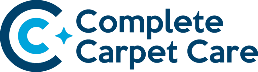
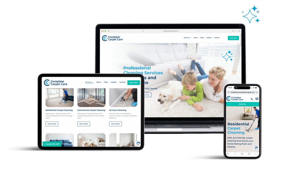
We began with a brand overhaul that prioritized clarity and intention. The custom logomark pairs seamlessly with the geometric wordmark, creating a bold, memorable identity. Additionally, the color palette reinforces cleanliness and trust. From there, we built the website on WordPress, which offers flexible design and a user-friendly CMS. Each page includes SEO-focused content that informs visitors and encourages action. To increase leads, we added strategic forms throughout the site. In addition, we integrated online booking functionality and launched a 15% off popup to encourage email signups. To top it all off, a custom photoshoot helped bring authenticity and brand consistency to the entire experience.
The refreshed brand identity emphasizes professionalism, reliability, and cleanliness. These are all essential traits of a trusted home service provider. The client wanted to keep the concept of the three C’s in the symbol. To achieve this, we designed a mark that is cleaner, more compact, and still incorporates all three C’s. Each C uses the same letterform as the wordmark, creating consistency across the brand. The dark blue and light blue C’s form a layered design, while the center C is formed through negative space.
The negative space hints at a freshly cleaned path, with a sparkle left behind. The sparkle reinforces the brand’s focus on cleanliness and ties the symbol directly to the carpet cleaning industry. In addition, the outermost C forms a perfect circle, which mirrors the shape of a rotary floor machine commonly used in tile and grout cleaning. We also refined the color palette using rich blues and crisp whites. Finally, clean, modern typography was selected to support the overall design system, which extends across the website, uniforms, and all branded materials.
The new website was built using WordPress to provide a flexible, scalable design framework and a user-friendly CMS for easy content updates. Each service, from Residential Carpet Cleaning to Air Duct and Tile & Grout Cleaning, lives on its own dedicated page with SEO-optimized content, FAQs, and clear calls to action. Lead generation forms are placed strategically throughout the site to capture inquiries and convert visitors into customers. We also integrated online booking through Housecall Pro and added a discount off popup to drive new leads. The result is a clean, conversion-focused site that helps customers find and book services quickly on any device.
Click on the button below to check out the website.